Transferring sketches or detailed motives such as maps to watercolour paper can be done by using backlight from windows. However, it can be uncomfortable to do it for a long time standing in an awkward position. If you don't want to buy light table, you can use your iPad instead. Its backlight makes it into a perfect, albeit small, light table!
The trick is to make sure that the touch is disabled from the screen so that it doesn't switch applications or do other funny things because of the pressure of your pen on it.
In order to disable touch, you need to go into the settings and use 'Guided access'. It is intended for parents want to let their toddlers use the iPad, but to not touch the screen and by mistake stop a movie (for example). This feature is perfect for painters too.
Do like this to temporarily disable touch from an iPad :
1. Go to 'Settings'
2. Go to 'Accessibility'
3. Go to 'Guided Access' (under the 'Learning' header)
4. Turn Guided Access on. Enter a passcode.
5. Now, you can go to some application that gives a strong backlight, such as an empty page in an e-reader or an empty note. Or, your could display an image on the iPad that you want to trace.
6. Press the home button three times, quickly.
7. Disable 'Touch'. Press start.
8. Viola! Use the iPad as a light table.
9. Enable Touch again by quickly pressing the home button three times, and entering your passcode.
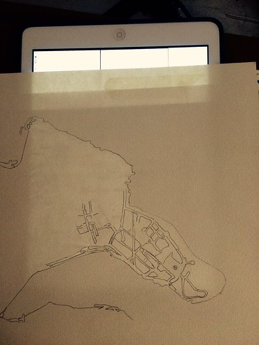
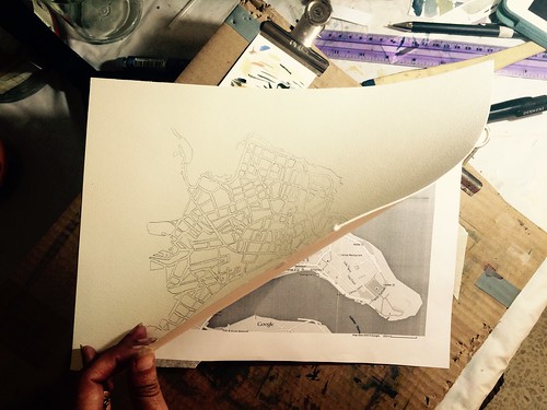
Because the iPad makes a quite small light table, I taped the background image i wanted to use to the back of my watercolour paper. This way, I can move the paper around the surface, and have a larger painting than the size of the iPad otherwise would admit. The paper in the image is 220 gsm, and allows the light to go through both the printed image and the watercolour paper. Thicker paper would be tricky.
Useful link:
- A more detailed instruction, with screenshots, on how to disable touch from the iPad, from wikihow.com.
The trick is to make sure that the touch is disabled from the screen so that it doesn't switch applications or do other funny things because of the pressure of your pen on it.
In order to disable touch, you need to go into the settings and use 'Guided access'. It is intended for parents want to let their toddlers use the iPad, but to not touch the screen and by mistake stop a movie (for example). This feature is perfect for painters too.
Do like this to temporarily disable touch from an iPad :
1. Go to 'Settings'
2. Go to 'Accessibility'
3. Go to 'Guided Access' (under the 'Learning' header)
4. Turn Guided Access on. Enter a passcode.
5. Now, you can go to some application that gives a strong backlight, such as an empty page in an e-reader or an empty note. Or, your could display an image on the iPad that you want to trace.
6. Press the home button three times, quickly.
7. Disable 'Touch'. Press start.
8. Viola! Use the iPad as a light table.
9. Enable Touch again by quickly pressing the home button three times, and entering your passcode.
Because the iPad makes a quite small light table, I taped the background image i wanted to use to the back of my watercolour paper. This way, I can move the paper around the surface, and have a larger painting than the size of the iPad otherwise would admit. The paper in the image is 220 gsm, and allows the light to go through both the printed image and the watercolour paper. Thicker paper would be tricky.
Useful link:
- A more detailed instruction, with screenshots, on how to disable touch from the iPad, from wikihow.com.